Seattle Public Transit
Project Description: Seattle Public Transit is composed of two transportation companies, King County Metro and Sound Transit. Seattle Public Transit serve the thousands of tourists and commuters that travel in and around Seattle each day. In order to best support riders, it is important to provide a cohesive, affordable, consistent visual system to communicate transportation information. Currently, the Seattle Transit system lacks cohesion and gives off an impression of sterility. With this project, I focused on welcoming tourists to our vibrant city and creating a friendlier consistent visual system.
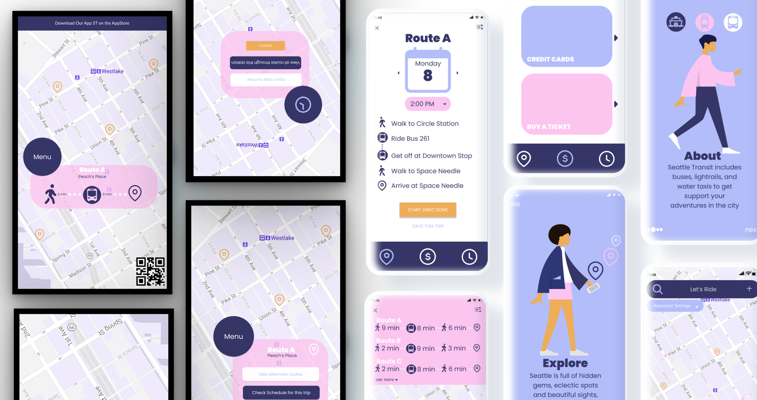
As a part of an advanced product design course, I was challenged to reimagine Seattle Public Transit and apply a cohesive visual system to mobile application, kiosks, and wayfinding elements.
Quick Stats
My Role: UX Designer
Team: Me, Myself, and I
Duration: June 2020 - August 2020
Tools: Figma, Procreate, Zoom & Summer vibes 😎
Research
During the research phase, I completed a field observation of public transportation users at my local link stop. During this field observation I found that there were multiple different categories of travelers who use transportation differently. With this information I created some storyboarding to show the overall journey of two different users.
Left: An international tourist wants to take public transport to see they cherry blossoms.
Right: A domestic tourist wants to take an adventure downtown using public transportation
User Flows
After my field observation, I created several user flows to show how a traveler would use the revised public transit application. Below you will see one example of the user flows that I completed.
After creating these assets I wrote a full design brief and create design goals. I wanted my design to be cohesive and welcoming.
Cohesive
Seattle Public Transit is currently composed of Sound Transit and King County transit. To make travel in Seattle more user friendly, it was important that these two entities worked together to provide a cohesive transit experience.
Welcoming
Some people would say Seattle has a reputation for being cold and hostile.
My goal was to challenge this stereotype and portray Seattle as welcoming, vibrant, and lively place.
Prototyping + Testing
In the prototyping phase I leveraged key research findings to sketch and wireframe both the kiosk and the mobile application. I did some light concept testing with the low fidelity sketches and some usability testing with the wireframes.
Wireframes
Then I moved my low-fidelity sketches to wireframes in Figma. The transit experience began to come together. I conducted brief usability testing with my roommates in order to get feedback on my designs.
Low fidelity prototype
I sketched each flow out with pen and paper in order to get my ideas out. This process helped me visualize what the mobile application could look like. I also showed this paper prototype to my classmates to get feedback before I moved to wire framing on Figma.
Let’s make travel fun again!
cue branding —->
Design Assets
Click through my interactive prototype below
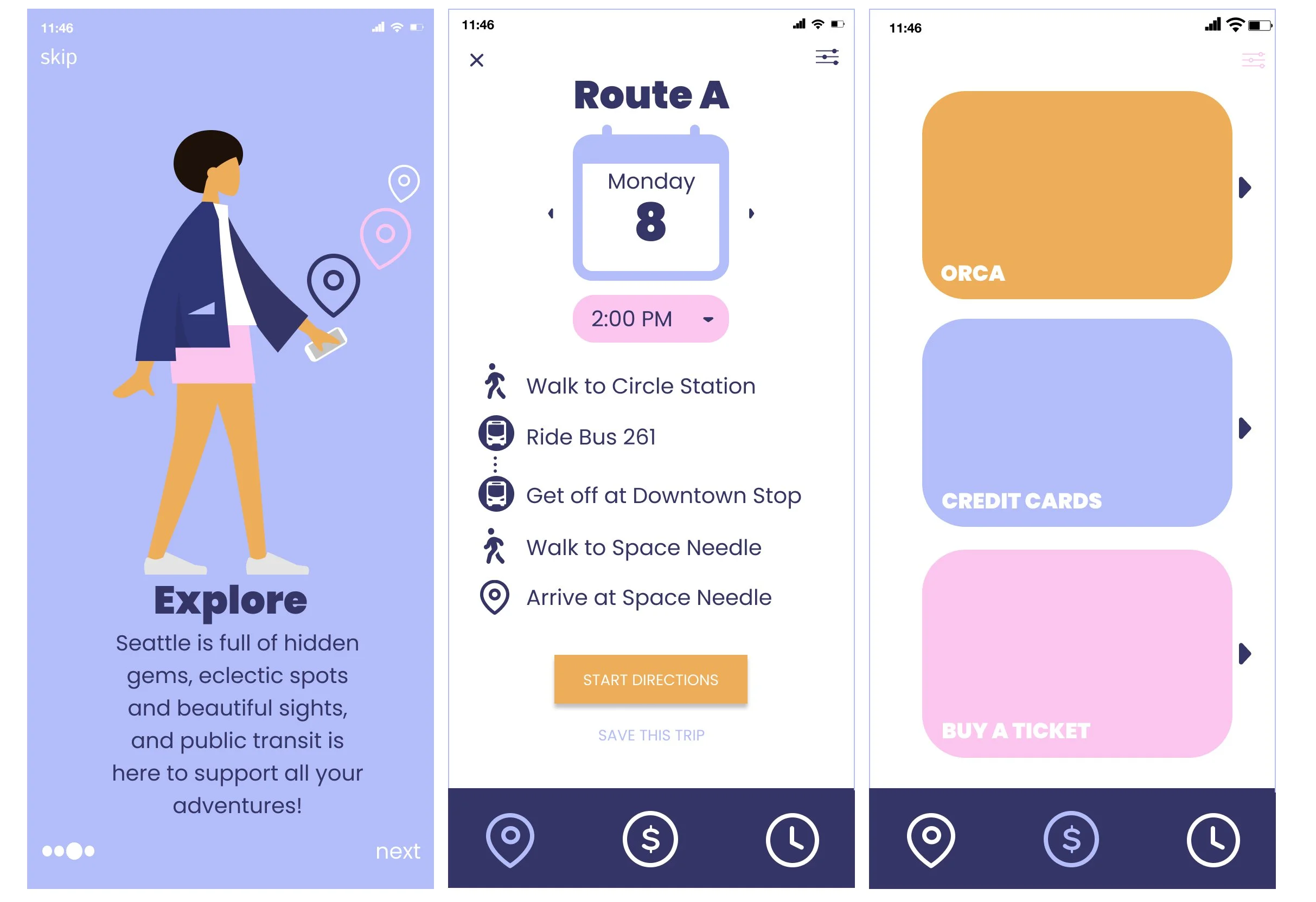
These are some of my favorite screens I wanted to highlight! Left: onboarding, Middle: trips, and Right: Money


