Numi
Project Description: My capstone team and I were challenged to re-imagine the post-pandemic international travel experience for people ages 20-30. COVID-19 impacted every person in every industry and our goal was to support a safe, comfortable, return to travel.
With this goal in mind, we created Numi, an interactive travel experience complete with a mobile application and an interactive travel lounge. Our application features an interactive travel preferences quiz, a budgeting tool, saved trip bundles, and syncs with our in-airport lounge space. The lounge space, or Numi Room, is an in-airport oasis that provides a safe, clean space to review vacation plans, grab a bite, or store luggage.
Quick Stats
My Role: Lead UX Researcher, Co-UX Designer
Team: theflyguys ✈️ (Me!, Sara Gustafson, Kathy Nguyen & Cameron Wood, featuring Nancy Gonzales)
Duration: January 2021 - June 2021
Tools: Figma, Zoom, Google Suite, Pen & Paper
View Our Video Pitch Below
Research
In order to dive deeper into the traveler industry, we conducted a multi-stage research process in order to assess current attitudes, motivations towards international travel before during and after the pandemic. To build background we conducted literature review and market research on transportation trends. Our next phase of research included a 15 question survey and 13 user interviews totaling over 2000 data points to analyze. We used affinity mapping, thematic analysis, and qualitative coding to synthesize our research into key outcomes.
We found that travelers are
Concerned about personal Health and Safety
Getting Vaccinated
Hesitant to be in close proximity to others
Excited by the possibilities of future travel
Design Requirements
Flexible
Numi supports users’ flexibility when booking and adjusting accomodations within their budget.
Cultural Awareness
Helps users make informed, culturally appropriate decisions when planning activities.
Covid-19 Cautious
Empowers travelers to navigate high-traffic spaces with confidence about cleanliness..
Transparent
Facilitates the sharing of location-specific guidance on safety and modes of transportation.
Informative
Provides travelers with real-time updates to their schedule (e.g., delays, cancellations, lines, etc.)
Customizable
Provides travelers with real-time updates to their schedule (e.g., delays, cancellations, lines, etc.)
After extensive ideation, to address these requirements, we created
an interactive system that includes a mobile application in addition to an in-airport lounge fitted with an IOT digital table.
Storyboard
This is my storyboard for the use case if Dillon needs to change an adventure reservation on the go. They change their reservation for Big Ben on public transportation
Information Architecture
With these key scenarios in mind, we mapped out the intricacies of the information architecture of our application. This flow demonstrates the hierarchy of all of the pages, and where each functionality would live. This step was very important to our work, as we had many design requirements to address and wanted to make sure all of the features connected in a logical concise way.
Key Features
Trips
With the Trips feature, travelers can book a myriad of adventures. With our trip planning feature travelers can specify a budget, view different flights, & select travel dates.
Explore
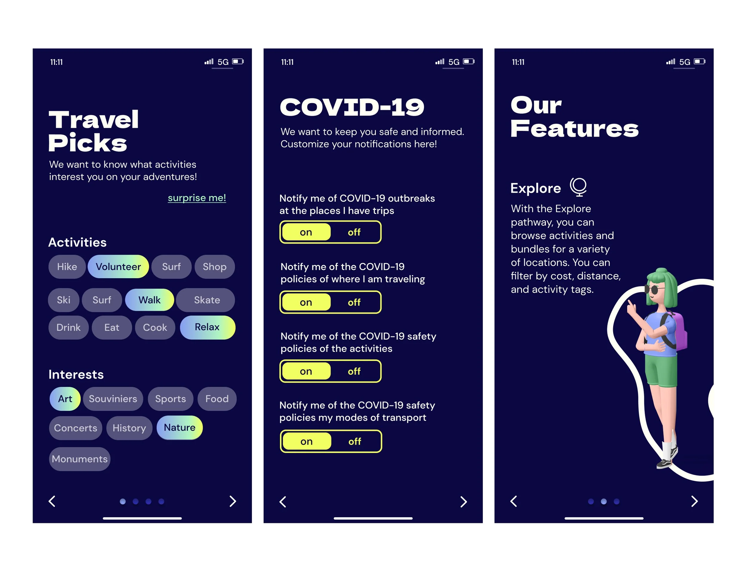
With the Explore pathway, travelers can browse activities and bundles for a variety of locations. They can filter by cost, distance, & activity tags.
Numi Room
In response to post-COVID safety, we’ve created an airport oasis. With the Numi Room feature, travelers can reserve a pod & explore the room.
Low- Fidelity Wireframes
To begin our process we sketched a low fidelity flow and then moved to Figma. On Figma we created a wireframe and prototyped it to prepare for user testing. To the left you will see three example screens that are part of the onboarding process of our application.
Usability Testing
Our team leveraged Usertesting.com and Maze.com to test our prototype. In correspondence with our design requirements, we asked participants to complete three basic tests
Create an account
Book a trip to London
Reserve a spot in the lounge
Find an excursion to the London Eye
Our metrics were effectiveness, efficiency, and satisfaction and are collected in the methods displayed in the chart to the right.
Bonus Points: Table Interface + Lounge
In order to bring our application into the airport space, we collaborated with a talented architect to create an interactive table for our lounge space. Covid-19 has changed the way we interact with a space, and one of our goals on this project was to create an experience beyond just our application.
Rendering by Nancy Gonzalez


